Research
To begin with I researched some existing book covers in order to get me thinking about the possibilities there were for book covers. I looked specifically at typographic book covers as that is the area the unit focuses on. I found these book covers that stood out to me visually and also contained techniques and elements I would like to incorporate into my own designs.


Here I did a little research into the book and wrote about why I wanted to do this book.

I like the different idea of each of these book covers but most of them use imagery as the main feature of the cover whereas mine will be a typographic book cover so I want to convey the character or nature of the story within my type like these designers have used with their imagery.
I made some basic mood boards that inspired me with this book some of the images are linked to plot points in the book and some are visuals that I have thought of when reading the book. This mood board will inspire me when designing my book cover.

Typography Mood Board
Here I gathered some typefaces I liked the style of and wanted to try out with my book cover as it is to be a typographic book cover. I like the hand drawn style fonts as they are more original and personal.

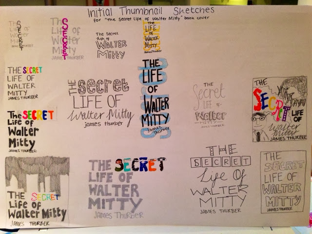
Here is my brainstorm for "The Secret Life of Walter Mitty" book so I could start thinking about some designs for the book cover. It has got my brain thinking about about some different possibilities and how I could convey the essence of the book.

Here I sketched out some fonts and layout ideas for my book cover. I had the idea of making the word 'secret' stand out as it is his secret life that the book is showcasing so it should stand out against the other words as his secret life is much more interesting than his regular life.
Idea/Design Development
I then developed a few of my ideas. Particularly the design with the cartoon drawing of Walter as I could show the basic idea for the storyline. I also tried a few other designs out further to see how they could look.
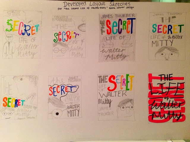

This is a book cover layout for The Secret Life of Walter Mitty. It has the secret and the blurb of the book in a dream bubble to show that Walter daydreams a lot. I like the various fonts as they add character but I would like to try some more simple ideas as it could be a little over the top.

I developed some of my ideas onto illustrator to see what ideas would work and what won't work in reality. We then did a pin up exercise where everyone in the class shared their opinions and constructive feedback on the designs. This really helped as they said they liked my handmade typefaces as they added a lot of unique character that the story has. They didn't like the last one as it looks more like a children's book so it would not attract my target audience.
I am going to explore some more of my own hand drawn fonts and see what I like the look of...

This was my favourite sketch layout for my book cover so I have decided to develop this idea further on illustrator. It uses an ensemble of different typefaces and I think this suits the character of the book so it is more appropriate to the brief than my previous ideas, especially as it is all type.
Making of the Book Cover

After I scanned in the sketch I edited it using photoshop and illustrator tools. I experimented with different colour combinations to see what would well...

I made this last one with the blue background as it catches your attention and also makes the word 'secret stand out, which was my aim and also the 'dream bubble' around 'secret' re-emphasises the meaning of the story as Walter dreams of his secret life.

I then made up a basic idea for the rest of the layout. I thought keeping the visual of the dream bubble going throughout the whole jacket would make it look more uniform and it also provides a nice space for the blurb. The title is quite long so the spine will be quite crammed so I will need to play around with the layout of the spine more.

I felt the words 'MITTY' and 'JAMES THURBER' weren't neat enough and so I wrote out a few options, scanned them in and swapped them into the design.


To make sure I was certain of my colour scheme I tried out a few combinations and I do like the blue one in the bottom row but I feel the red in my original design makes the text pop more which is my aim for the book cover but at least now I know the colour combination I have is my favourite.


I then put a drop shadow effect behind the dream bubble to give it some perspective. So here is the finished front cover. I think it grabs your attention well with the bold fonts which means that it fits the brief as it is a typographic book cover.
Here is the finished spine with the publishers logo. I placed the title into three different sections so that it could fit neatly across the spine while still being readable.

Here is the back and one of the gate folds. Starting at the top, I added two more dream bubble/clouds to fill the space better. It contains the blurb in a quirky hand-written style font which fits with the fonts on the front cover. I also added a review in the same font to persuade readers to buy the book. Then we have the barcode, ISBN number, price and publishers logo in bottom right corner. I added this sketch of an adventure to the book to add some life and intrigue as the front was mainly typographic so I felt it needed a visual for readers to engage with. Finally, I added the word POKATA as it is a key word throughout the book and would drive up some interest as readers want to know what that means. Both gate folds are the same.
Here is the final layout in InDesign...

I think the colour scheme of my book cover attracts your eye because of the bright blue and blue makes people feel relaxed and serene. The red will make people think of passion and excitement which the story promises so I think the colours help express the character of the book so the audience know whether it is a good book for them.
I think the front covers layout is neat and the plain background helps to make the title stand out more. I think the back cover could be better laid out by making things more centred so that there is a clear direction for the reader to read in.
The legibility of the type is very clear in my opinion as it is in a bold font on a lighter background and the letters are neatly spaced apart. Maybe the colour of 'mitty' could be darker to stand out more but I think it ties in well with the 'Secret'
The large size of the 'Secret' is the first thing you notice so that helps you to read down the page as intended so I think the book jackets readability is very clear.
E-Reader Cover

Then I made the e-reader cover which required me to just play around with the layout and size of the lettering to fit to the screen size.
Extra Work - 2nd E-Reader Cover/Book Design
I experimented with different type techniques to see the variety of ways you can manipulate type to create a more unique style to the lettering. I also did a mood board for the book The Lion, The Witch & The Wardrobe.


I then tried out this idea for incorporating the image of the word within the word.

As I finished the unit early I decided to try out another book cover design so I made this typographic book cover for 'The Lion, The Witch & The Wardrobe' by C.S. Lewis. I used my skills from trying out different type techniques to illustrate the word from it's meaning so 'Lion' looks like a lion and so fourth.